Monday, 23 May 2016

OUGD 603 – Extended Practice Evaluation.

OUGD 603 – Extended Practice Evaluation.

Overall I am really pleased with how this module has gone. Throughout the year, I think you can see my design work getting stronger and stronger. I got to work with clients for the first time, which was a different experience. I really enjoy the structure of working with a client and getting told what to do and having constant critic and feedback. Also, this year I got to do a lot of editorial work, which is something that I really enjoy. During the course of this year, I also get to print and bind publications, during a number of briefs I did have trouble with this­. I had trouble cutting out the zines and using the guillotine, which ended up taking chunks out of my work. As I am still pretty new at printing publications, I blame my error on that. I hope to become better at it with time. In the future, I want to take my publications to a professional printer to be printed and bound to ensure they are the best quality they can be. I got to work collaboratively multiple times again this year. I found that working with another person improved my organisation skills. When you are working with another person you can’t always just work when you want to, you have to fit around them, this took a lot of organising.

My time management this year has really improved. With having to juggle so many briefs at once I found that managing my time well was key. I tried to not work on the briefs one brief at a time, but working on multiple briefs each week. This is much more similar to how a real studio would work, so it is best that I get used to juggling briefs now. Organization was also really important this year. I kept everything in subfolders and made sure everything was clearly labeled. In the past I usually names them “final final final 1” which starts to get confusing. This year through clearly labeling everything and subfolders it made finding the files I needed much more efficient.

What I wished I’d done: I would have liked to have done more screen printing, I found that I used it hardly at all this year with the process being so time-consuming. For my portfolio, I think it would have been much stronger if I could have shown different processes and the different ways in which I can work. Another thing I would have of done differently is not leaving printing until the last minute. I usually finish my designs then waiting until the end of the year to actually print them. This is not the way to work; it leaves no time to fix any printing errors. Three of my publications I would have liked to print again but I didn’t have the time to. Not leaving printing so late means that I have more time to ensure that I am happy with my final designs and more time for trial and error. I wish I had spent more time in the studio. Towards the end of the year, I found I that I was in the studio every day. Working for the studio I was able to produce more in a shorter time as I had fewer distractions. Also had the printer and scanner right there to use when I wanted. I wish that I had spent more time in the studio from the beginning of the year.

Sunday, 22 May 2016

OUGD 603 - Brief 11, Punk Zine 1 Week Brief Evaluation

Hands down, this was the brief that I enjoyed doing the most. I had always wanted to create a tradition punk zine and finally got the chance. The zine looked at The Women of Punk and sexism in the music industry during the punk movement. Taking particular inspiration from the riot grrrl movement and feminist zines from the early 90's. I gave myself a week to gather all the content and to create the zine. This was because it was something I wanted to focus my full attention on, and not be interrupted by any other briefs. It was very time consuming cutting out all of the content, but working physically allowed me to me much more creative with my layout design and try different things. Not working digitally meant that I didn't have much room for error, fixing a mistake was much more time consuming. Usually, I stick to very minimal design, a use a grid. Working very differently to that was a whole new experience that I really enjoyed. I already have some zine idea what I want to create in this style again. The print came out great quality and the colour came out really one. One problem that I had was using the guillotine to cut it out, I didn't but the lock on and it didn't cut straight and ended up cropping it down much more than I would have liked. In future with small publications, I am going to use a craft knife to cut it to, to ensure accuracy

OUDG 603 - Brief 9, Toolally Lookbook Evaluation

This was a really fun brief on a whole. I got to work on image styling photographs for the first time. I went out and got all the stuff for the sets and then took all the photos myself. This was also my first time doing product photography. In the past, I always felt I wasn't the strongest photographer, but this brief gave me confidence in my abilities, I am still nowhere near perfect, but I am getting better. Design wise I was happy with the layout of the book, it is something a bit different that will stand out from the rest. I think that the finished printed book turned out really well, it is one of the pieces that i am most proud of from this year. It was also the brief that went the smoothest. I thin that I planned my time really well, got it printed well in advance of the deadline. Printing seems to be something that i just always leave until the last minute.

OUGD 603 - Brief 7, Feathr Evaluation

I decided to do the Feathr competition again this year because my design last year was one of the ones that they selected and also because it was brief I really enjoyed doing. Feathr was a change to work with patterns, something I don't do that often and to make something aesthetically pleasing and creative. From doing this brief I learnt that working with repeat patterns requires a lot or accuracy. With it being just a day brief, I got to understand the pressure of working with a tight deadline and even though it was designed in a short time, I am happy with what I achieved in one day. If I had have had more time, I would have created more designs to submit. Last year I faced the problem of the colours changing once I had uploaded them to the site. The problem was that because they wall paper print would need to work in CMYK for printing, but also needed to work RGB for the website. I had to work with colours that worked within this, which had it slight limitations.

OUGD 603 - Brief 6 Feminism Zine Evaluation

This brief was something that I thought was really successful. It took us a long time to fit it around our other work, first, we wanted to get our dissertations out of the way, then hyperloop, after that was the Easter holidays and I was also on a two-week placement. The start of April we finally found time to work on designing the zine. Because we completed such a big brief in such a small time I think there are areas for improvement and development, but considering the small time scale I think we worked well in organising our time, we were having multiple meeting a week to work on the zine, and we set up a communal google drive to make share files easier. The main thing that we wanted was for the zine to educate people on gender equality, which I think that it fulfils. While printing out the finished zine, we realised we accidentally had the inDesign document set to A4 and the print came out way too big. From this we have learnt to check the document fully of any mistakes before printing, to save time and money. Once it was printing at the right size, it looked great. We were both really pleased with the print quality and how it was bound. As a team, Eva and I worked well together. We didn't come across any issues. We were able to split the work well. I would definitely consider and enjoy working with Eva again in the future.

OUGD 603 - Brief 3, Beauty Zine Evaluation

I have been working on this brief though out the year, very slowly piecing the two issues together. Overall I am happy with how it looks design wise. This was the first time working on such a big editorial project and I really enjoyed doing it. Actually creating a magazine with two issues took a lot of planning and organising, a found that this actually improved my time management skills. When you are working with another person you can always just work when you want to, you have to fit around them, this took a lot of organising as I had to travel home so that we could have a meeting about the zine every few weeks. I found collaborating to be a challenge. As I couldn't start designing until I had the article content from Becki, I started designing a lot later than I would have hope. I also felt like I constantly had to nag Becki to get it done, it was more like she was working for me rather than with me. On the other hand, it was good to get a different perspective when idea generation and constantly getting feedback on my designs. Getting to work illustratively and by hand is something that I always enjoy doing and feel that it from this brief my drawing had got a lot stronger on a whole. Designing went smoothly for me, the big problem I faced was printing. I did a test print to check that colour would all come out okay, which they did. However when I took both issues down to digital print to be printed they colours were really off. Because of this, I want to revisit the colours I chose and pick something that will print better. Also, I had trouble cutting it out, the guillotine wasn’t locked in placed and ended up taking chuck too much out of the zines. As I am still pretty new at printing publications, I blame my error on that. I hope to become better at it with time. As this is the brief I am extending for the final show, I want to take them to a professional printer to be printed and bound to ensure they are the best quality.


OUGD 603 - Brief 11, Punk Zine 1 Week Brief

The Brief

The brief is to create a traditional punk zine. The zines layout has to be all arranged by hand. The purpose of this brief is to try a different style of editorial design, seeing how it is to step away from digital design. I will do it on the topic of female oppression in the music industry, looking at the women of punk. Sexism in music is still a something that is relevant today.

limitations: - Time is going to be an issue, this will be a lengthy process.
- Working in print always has its limitations, things such as size, printing costs.
- Not working with InDesign will mean that I won't have much room for error, fixing a mistake would be much more time consuming.

audience: Punk music fans, feminists, it can be aimed at both men and women. Aged 16-30.

time scale: I am giving myself a week to gather all the content and to create the zine. This was because it was something I wanted to focus my attention on, and not be interrupted by any other briefs.

Research

punk zine research

I researched into different punk zines for layout inspiration. I found that it involves a lot of hand type and roughly cut out type and images. Most are black and white, or black on coloured stock. This would have been so that they were easily and cheaply reproducible. Everything is done by hand then scanned/photocopies. 


modern day zines


Riot Grrrl 

The riot grrrl punk feminist movement was a dig influence to my zine. The movement started in the early 90's and was thought to be the starting point of third wave feminism. The during the movement lots of people started to produce feminist zines under the riot grrrl title.  

It is a subcultural movement that combines feminist consciousness and punk style and politics.  It has also been described as a musical genre that came out of indie rock, with the punk scene serving as an inspiration for a musical movement in which women could express themselves in the same way men had been doing for the past several years.

Riot grrrl bands often address issues such as rape, domestic abuse, sexuality, racism, patriarchy, and female empowerment. Primary bands associated with the movement include Bikini Kill, Bratmobile,Heavens to Betsy, Excuse 17, Huggy Bear, Skinned Teen, Emily's Sassy Lime and Sleater-Kinney, as well as queercore groups like Team Dresch and The Third Sex. In addition to a music scene andgenre, riot grrrl is a subculture involving a DIY ethic, zines, art, political action, and activism.


 Visually very similar to other punk zines. Including hand type and roughly can out images and type.


sexism in the music industry

The zine will focus on The Women of Punk. Looking into the female oppression in the music industry at the time. The zine will looking at the usually overlooked women that were involved in the punk music. During the 70's and 80's it was very hard for women to be taken seriously as musicians, even more so in the mans world of punk.


feminism


Content


I made all of the images black in white to create unity and also to match the aesthetics of past punk zines.

Text:


Experimentation

Cover:


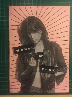
I started to experiment with different layouts for the cover. Not working digitally made it very easy to reposition the type where ever I wanted it. The font it Gotham, I wanted something strong in relation to the punk movement.


 I introduced hand type, to give it more of a personal hand made feel.


Images:
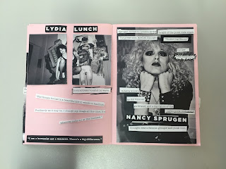
I stared by cutting out all the images and positioning them in the page .


I tried to be creative with how I arranged the images. Using multiple copies of an image or deconstructing an image.


Text:
I then added in the text. The information that i used were mainly facts, so that the text could be read in any order. For the body text I found a font similar to the ones used in the riot grrrl zines. I think it worked well because it looked like it had been type on a typewriter.


I found that breaking up the text looked best, and meant that it would work well layered over images. I cut out the text in a blocked fashion because this is similar to the zines from the riot grrrl movement.


Scanning it in

It scanned in really well, the image quality was very good. I was worried that it might not have scanned it clearing, but I am really happy with the results.


Editing:

I edited the background to make it a much more vibrate pink. Harsh bright colours were seen throughout the punk movement and also in the zines. Also I think that the text and images stand out much more on this background.


Final Print

the print came out great quality and the colour came out really one. One problem that I had was using the guillotine to cut it out, I didn't but the lock on and it didn't cut straight and ended up cropping it down much more than i would have liked. In future with small publications i am going to use a craft knife to cut it to, to insure accuracy.


Extending

I really enjoyed working this way while creating a zine, and have had lots of positive feedback on the final zine. In the future I would like to extend it further, looking at overlooked Women of Rock, Rap and so on.