Over all I have enjoyed
this module, I think it is my favourite so far. By being able to choose our own
topics it make them much more personal and enjoyable and I think that I have
produced better quality work because of this.
Studio Brief 1
I really enjoyed being able
to pick your own topic for this project. It allowed be to be able to pick
something important to me and that I am interested in, and because of this I
think my work and research was better because of it.
I had two outcomes for this
brief a book and a poster series. My practical work was in response to how
gender should be perceived, how it is more of a spectrum that an either or
situation. Overall I am very happy with both of the finished designs. I set out
to create something education, which I think I have fulfilled to my best
ability. The colour scheme I have used was a main focus of the design and I
think it has turned out really well. On a whole it was kept very neutral, this
is so it didn’t fit in with the typical the gender stereotypes. One of the main
strengths of this project was my concept, I felt I had a really strong concept
and because of this it allowed be to push my designs further. In the past I
have been focused more on what it athletically looked like. This time I tried
to balance out how it looked as well as having a concept behind my design
decisions. One of the main weaknesses from the project was printing. This time
I gave myself a lot of time while designing and planning my time, but I did not
plan enough time to print. Because of this I think the final professional look
of the book really suffered, the right stock choice and a good printer quality
could have transformed the final thing. In future to prevent this issue I will
book print slots months in advance before all of my major deadlines.
Studio Brief 2
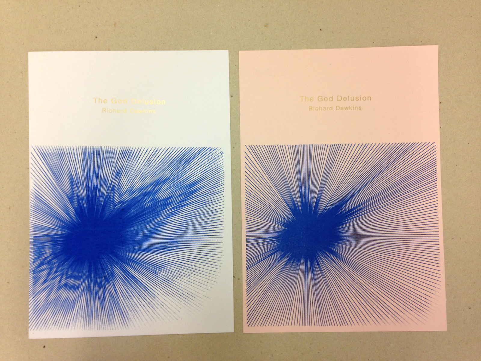
It was interesting to
look into a lot of different theory books. I was close to choosing ‘A brief
history of time’ by Steven Hawkins, but I ended up going with the ‘The God
Delusion’ by Richard Dawkins. The god delusion is about proving about how god
isn’t real. As an atheist I found this
book fascinating and revelled in designing the cover. I really enjoyed this
brief, especially screen-printing onto some G F Smith stock. I usually don’t
put as much into my stock as I probably should. But this time I think that by
putting extra thought into the stock, it really made a big impact on the final
print, making my work look much more professional and high end. I wanted to
create something simplistic and modern, which atheism is, but also something
that looked like the bible as the book gets described as the atheist bible. The
modern line vector (representing the big bang, and how religion is derived from
the same root) and the gold text work well with expressing both of these things.
The book is seen as quite a controversial topic, so I wanted to keep the cover
simple and clean. I planned by time with this project, I left gave myself
plenty of time to design it as well and to screen print it, because of this I was
much less stressed that I usually am during a project, I was able to enjoy it
more. If I had have had more time I would have like to have actually finished
the book, I only got half way and have to use the internet for chapter
summaries. I think that if I had finished the I would have had a greater
understanding of Dawkins theories and beliefs and this would have been
reflected in my work.