
Herbal Essences New Bottle Designs

Production Method - Stone.
Anatomy - Script font that includes thick and thin strokes. Uppercase and lowercase.
Identity - Optima
Character - Decorative, feminine, sophisticated.
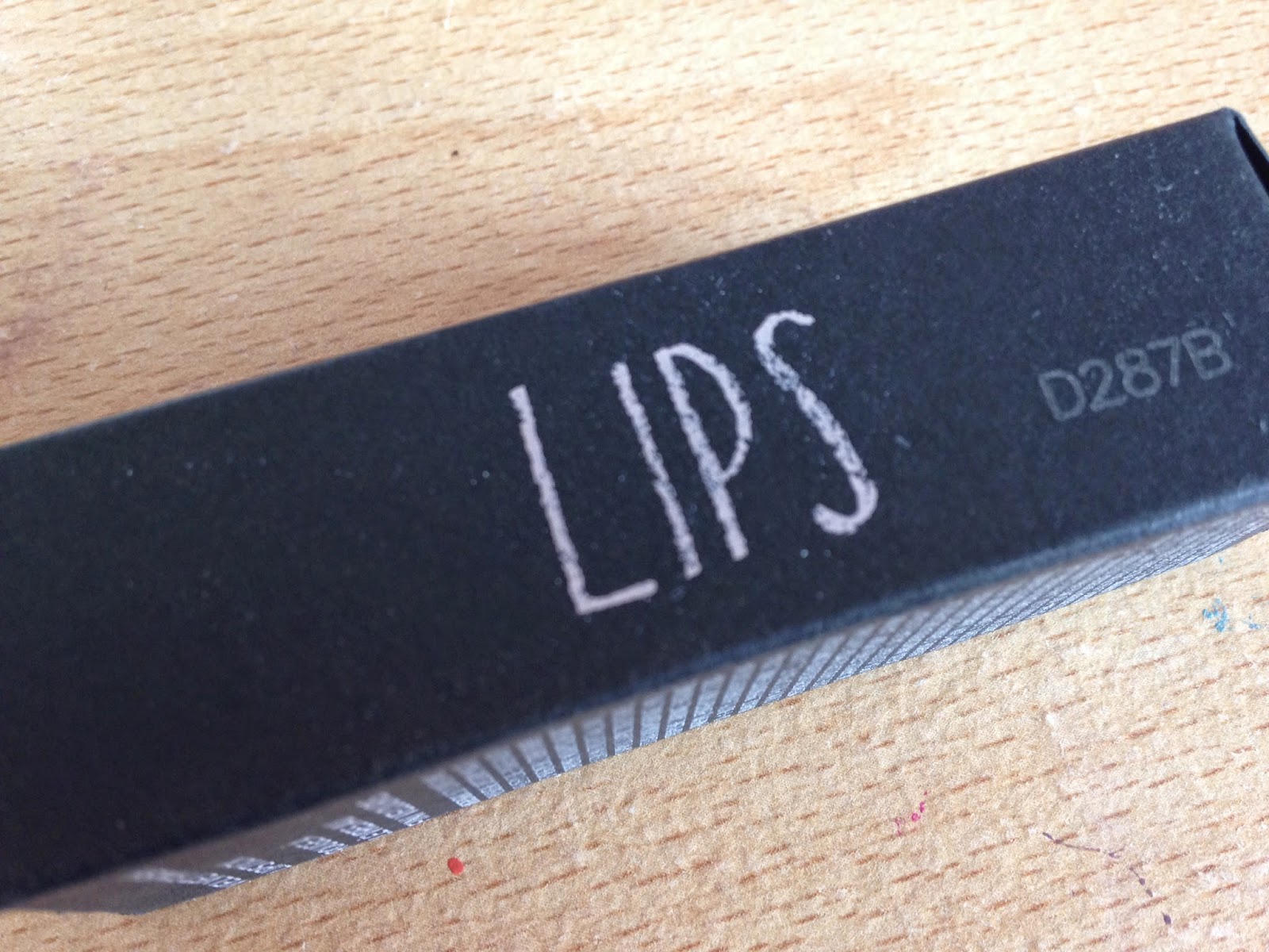
Mac Make-up

Production Method - Digital.
Anatomy - Sans serif, well balanced weight. Uppercase, no kerning at all.
Identity - Unknown
Character - Modern, Minimal, simple, angular, stretched, sophisticated.
L'Occitane

L'occitane is company originating from the south of france and I think that the serif font that has been used has an elegant provence feel to it.
Production Method - Stone.
Anatomy - Serif font that includes thick and thin strokes. Uppercase. Light
Identity - Name: Garamond. Designer: Claude Garamond; he is french. I think that this shows the thought that has gone behind choosing this font, they selected a french font to go with their french roots.
Character - Sophisticated, elegant, formal, decorative, feminine.
Lee Stafford

The composition of text in this product caught my attention, because i think that it reads well. Using a mixture of point sizes and upper and lowercase glifs causing your eyes to dart around the type.
Production Method - Stone.
Anatomy - Sans serif, light gothic font. Well balanced with a thin weight. Mixture of upper and lowercase.
Identity - Unknown gothic font.
Character - Feminine, simple, balanced.
Barry M

Barry M script logo. Barry M is known for its nail varnishes, which come in small bottles. I do not think that they thought about this when designing their script logo. On a bigger scale I think that it would work fine, but on the small scale it is illegible. The top sans serif gothic font is very clear, something like this would be much more appropriate.
Production Method - Hand Rendered.
Anatomy - Script font that includes thick and thin strokes. Uppercase and lowercase. Unbalanced.
Identity - Name: G-Unit. Designer: Unknown
Character - Decorative, feminine.
Topshop Make-up

Production Method - Hand Rendered.
Anatomy - Sans serif, uppercase, balanced.
Identity - Unknown
Character - Decorative, playful, fun, childish.

Production Method - Wood.
Anatomy - Sans serif, balanced equal stroke weights, bold, kerning.
Identity - Champion
Character - Simple, bold, minimal.

Production Method - Digital.
Anatomy - Sans serif, light balanced equal stroke weights.
Identity - Unknown
Character - Simple, bold, minimal, feminine.
No comments:
Post a Comment