
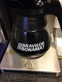
Type found in the cafe that I work in.

Production Method - Hand rendered.
Anatomy - Uppercase font, script, even strokes, drop shadow.
Identity - Unknown.
Character - Fun, friendly, childish.

Production Method - Digital.
Anatomy - Serif, mixed stroke weights.
Identity - Unknown Unknown Unknown - Sophisticated, formal, feminine.
Production Method - Digital.
Anatomy - Uppercase font, sans serif, balanced, bold and italic.
Identity - Unknown.
Character - Minimal, masculine, bold, simple.Type found in my local pub.

Production Method - Digital.
Anatomy - Uppercase font, sans serif, equal strokes, gothic, tracking.
Identity - Unknown.
Character - Geometric, minimal, friendly, simple.
Strongbow
 Character - Sophisticated, minimal, simple.

 Character - Sophisticated, minimal, geometric.

 Character - Sophisticated, minimal, simple.
 Character - Sophisticated, delicate, formal, feminine, decorative.
 Character - Minimal, simple, friendly.


Kopparberg

Bulmers

Rekorderlig


Production Method - Digital.
Anatomy - Uppercase font, sans serif, balanced strokes.
Identity - Unknown.
Absolut Vodka
Production Method - Digital.
Anatomy - Uppercase font, bold sans serif, equal line weight, balanced, kerning, unbracketed.
Identity - Futura Condensed Extra Bold
Designer- Paul Renner.
Type found in my kitchen
Cadbury
Production Method - Script hand rendered.
Anatomy - Script brush font, well balanced, all the glyphs are joined.
Identity - Unknown. I don't like the font that is used. The individual glyphs are very hard to read.
Character - Fun, friendly, decorative.
Production Method - Digital.
Anatomy - Serif, equal line weight, balanced, kerning.
Identity - Unknown
Production Method - Script, hand rendered, the glyphs are joined.
Anatomy - Script, readable and legible.
Identity - Unknown
Production Method - Digital.
Anatomy - Sans serif, gothic, rounded. equal stroke weight, balanced, kerning.
Identity - Unknown
Production Method - Digital.
Anatomy - Serif, even strokes, drop shadow, kerning, curled decorations at the feet and loop.
Identity - Unknown.
Character - Fun, friendly, decorative.
Production Method - Hand rendered.
Anatomy - Script, mixed stroke weights, drop shadow, italics, kerning.
Identity - Unknown.
Character - Friendly, feminine, decorative, formal.
Production Method - Lead.
Anatomy - Uppercase font, sans serif, even strokes, kerning, the 'L' is notably thinner than the other glyphs.
Identity - Unknown.
Character - Simple, friendly, modern, minimal, retro.
'TEA'
Production Method - Digital.
Anatomy - Uppercase font, serif, kerning, drop shadow, lack of negative space.
Identity - Unknown.
Character - Fun, Decorative, friendly, old fashioned feel, it looks like a font that would have been used for an old circus.
Production Method - Digital.
Anatomy - Serif, oval counters, kerning, contrast in stroke weights..
Identity - Unknown.
Character - Fun, friendly, simple, sophisticated, feminine.
Production Method - Hand rendered.
Anatomy - Script font, italics, the glyphs are joint together, well balanced even weight.
Identity - Unknown.
Character - Feminine, formal, decorative, delicate.
Kopparberg
Production Method - Stencil.
Anatomy - Uppercase font, serif, kerning, extended leg on the 'K', mixed stroke weights.
Identity - Unknown.
Character - Friendly, simple.
Production Method - Digital.
Anatomy - Uppercase font, sans serif, bold, slab, kerning, drop shadow, mixed stroke weight.
Identity - Unknown.
Character - Fun, friendly, old fashioned feel, it looks like a font that would have been used for an old circus..
Rekorderlig
Production Method - Digital.
Anatomy - Uppercase font, sans serif, light, mixed stroke weights.
Identity - Unknown.
Character - Friendly, simple.
Production Method - Digital.
Anatomy - Script. Different line weights. The bottom of the glyph seems to be much fatter and bolder than the top, giving it a bottom heavy look.
Identity - Brandywine.
Character - Retro, fun, friendly, feminine.
Production Method - Digital.
Anatomy - Serif font with a contrast in the stroke weight. Upper and lowercase.
Identity - Sahara Bodoni.
Character - Simple, bold, rounded.
'Speakeasy'
Production Method - Hand rendered.
Anatomy - There is a slight serif visible, the strokes are equal. Uppercase, with a drop shadow. Added decoration to the foot of the 'S'.
Identity - Horndon.
Character - Friendly, fun, simple.
Production Method - Stencil.
Anatomy - Serif font, contrast in the stroke weight. It included both lower and uppercase characters, kerning.
Identity - Troover Roman.
Character - Simple, sophisticated, minimal.
'Poison'
Production Method - Digital.
Anatomy - San serif, balanced stroke weight, kerning.
Identity - MVB Solano Gothic.
Character - Light, simple, minimal, modern.
Production Method - Block print.
Anatomy - A bold san serif font with a equal stroke weight. Uppercase, with a drop shadow, a notable feature is how their are no counter and very little negative space.
Identity - Prismatic.
Character - Bold, exciting, dramatic.
Production Method - Digital.
Anatomy - San serif font with a balanced stroke weight. Uppercase, with a square slabby feel to it. Kerning
Identity - Sullivan.
Character - Bold, fun, friendly.
'Beautiful'
Production Method - Digital.
Anatomy - Script font with a well balanced equal stroke weight. Both upper and lowercase, with a drop shadow
Identity - Mertroscript.
Character - Feminine, friendly.
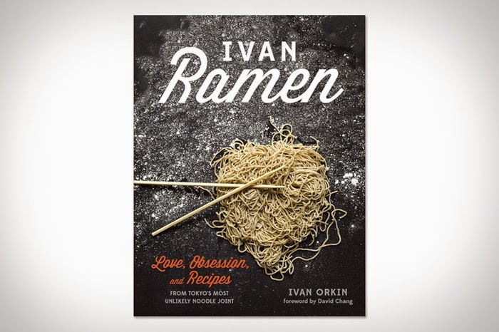
'Ivan'
Production Method - Digital.
Anatomy - Script font with a well balanced stroke weight. Upper and lower case, italic.
Identity - Wisdom Script.
Character - Retro, simple, friendly.
Production Method - Digital.
Anatomy - San serif font with a well balanced stroke weight. Uppercase, rounded with no sharp apex's and corners.
Identity - Harry.
Character - Friendly, simple, minimal.
Production Method - Digital.
Anatomy - San serif font with a equal stroke weight. Uppercase, with tracking and a curved baseline.
Identity - Pluto.
Character - Simple, modern, minimal, geometric.
Production Method - Digital.
Anatomy - San serif font with a mixed stroke weight. Uppercase, it looks like a minimal form of a psychedelic font.
Identity - Hobo.
Character - Fun, friendly.
Production Method - Digital.
Anatomy - San serif font with a well balanced stroke weight. Uppercase and lowercase, light and geometric. Kerning
Identity - GT Walsheim.
Character - Geometric, minimal, simple, modern.
Production Method - Hand Rendered.
Anatomy - Serif font with a contrasted stroke weight. Uppercase. Has a personal handwritten feel to it.
Identity - Chevalier Stripes.
Character - Elegant, sophisticated.
No comments:
Post a Comment