
Brief
A client has asked me to make her a portable portfolio for interviews.
Rhianon White is a Surface Pattern graduate and needs to have a way for her to show her work on a smaller scale in interviews without having to take big rolls of paper with her. I will need to produce a way to showcase her work on a smaller more portable scale. She has also asked me to redesign her logo, business cards and make her CV look more creative and exciting.
Limitations: - As she has taken all the photographs of her work herself, there is a risk of some of the images being low quality or badly shot. So I need to find a way to make them work, no matter what.
- Working with a lot of prints and colours. She has a wide range of patterns and prints is many different colours, so trying to get all they to work together might be an issue.
Background/ Considerations
Research into portfolio designs.
Mandatory Requirements
Should include blog posts and design boards to show your development process and research, that has influenced your practice.
Deliverables
Some form of a portfolio for her work. Re-brand her, including business cards, logo, and CV.
Research
I am going to be creating a publication/portfolio, that can be used as a PDF or printed and send to possible job opportunities,


A friendly tone of voice is something I would like to consider when designing. It makes it feel much more personal, which is important with a portfolio.
Rhianon's Work


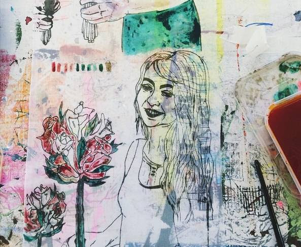


Her current business cards. Currently, they are too cramped and there is too much going on. Her design still is quite busy, so because of this, I think that the design that accompanies it should be very simple, and the content should be as little as possible to allow the prints/patterns to speak for themselves.
Branding


My first idea for the logo was to create something from one stroke. Becuase she included a lot of hand stitching in her work, I wanted to use one stroke with the type to represent the thread.


I included the dashed line to represent stitching.


In the end, I thought the logo want very clear, and the letters can't be clearly identified, so I decided to scrap it.

The final logo I went with was so much more simple, again keeping the dashed lines to show stitching. I kept the logo minimal so that it would work well with her work, and kept it white so it can work over any colour depending on what she has made. The font that I used was Avenir Heavy Oblique. I wanted a strong font that could stand out over her patterns.


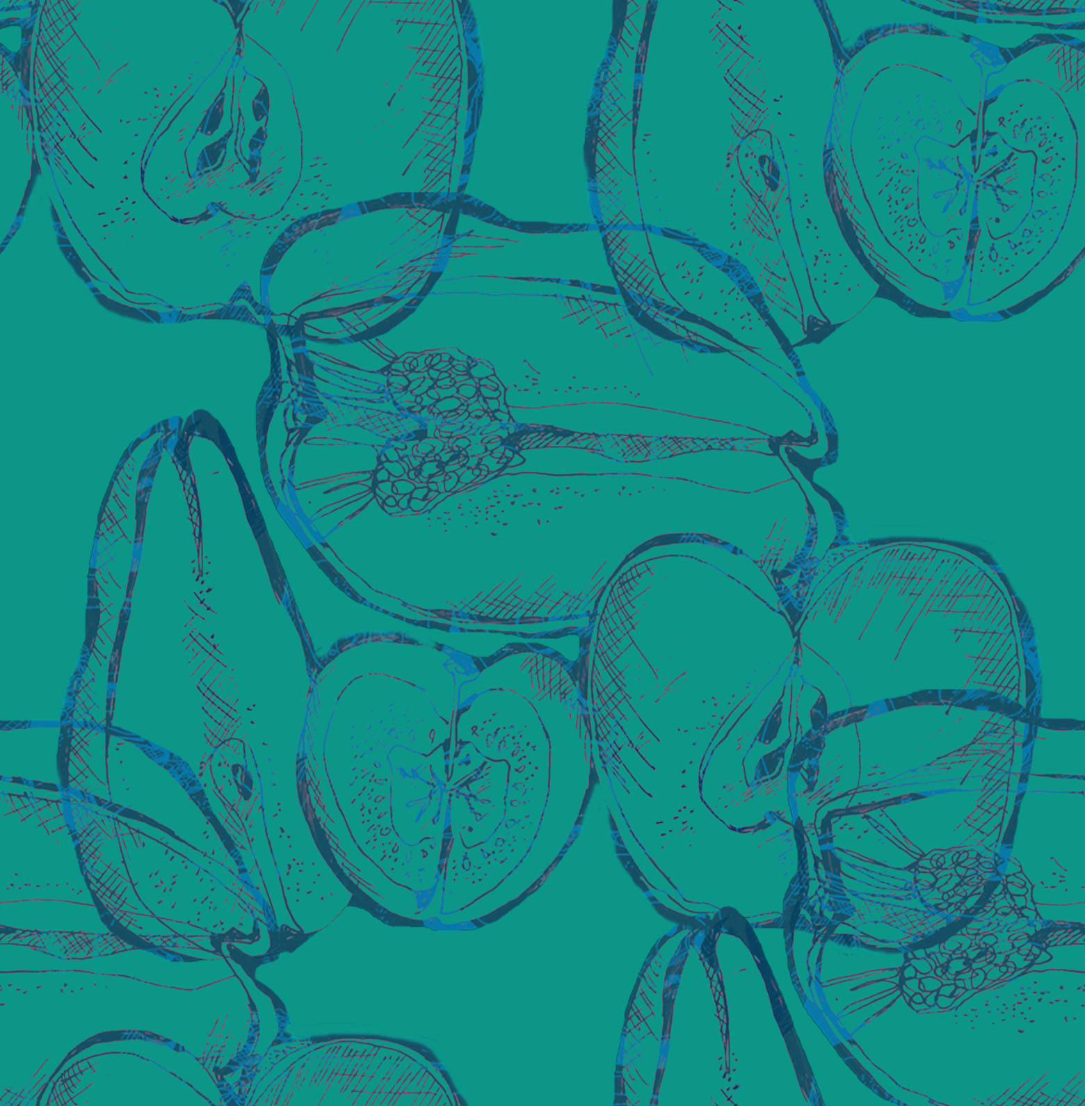
I made a colour pallet from her work and showed how the different colours could be used with the logo depending on what she has designed.
Business Cards
side 1

I started to play around with using an image as the background. I wanted her work to be the focal point so kept the design very minimal.


Below is the finished design. Showing how it would work with different prints.


side 2

I felt that this looked too crowded so decided to remove some of the type.

This is the finished design for the back of the business card. I found that the type looked much more spaced out when it was landscape. And again I have interpreted the dashed line as a simplistic was of representing sewing
Publication
For Rhianon to be able to take her work to interviews, I created a publication. I thought that A4 pages would be a perfect size, it is portable, yet big enough to see her work clearly.

I tried to stick the same layout, but with all the different sizes photos I fount it easier to create a different layout for each spread.
Below is some experimentation of the cover.


I used Avenir Heavy Oblique for the headers, this was because I used it for the logo. For the body text ,I used Avenir Book. While designing the spreads I had to overcome the problem of having lots of different coloured images that I needed to include. I tried to group the images into colours and similar design themes when placing them onto the spreads.


Unfortunately, when it printed, the pages were all in the wrong order. And because I didn't cut it out and bind it until a couple of days later I didn't notice until it was too late. From this, I have learnt I should check my printing there and then for any mistakes or errors. Overall I am happy with how the images have printed and how the colours came out.
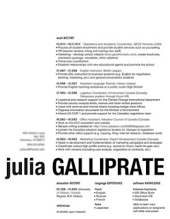
CV
Research:
I did some research into well designed CV's to get some inspiration for the layout.


 Really like the negative space in this, being less text heavy makes it a much stronger design.
Research:
I did some research into well designed CV's to get some inspiration for the layout.


Design:


Trying to get all of they type into such a small space was a challenge. I used two columns and clear headings so that the type could be broken up a bit.


The header is totally optional, so she can change the header as she produces new work. Above are just some examples of different variations.

Feedback
Rhianon was really happy with how everything turned out and didn't have anything she wanted to change. Personally, I think the layout of the publication could have been developed further, this is something that I can keep working on for her.
No comments:
Post a Comment